JT Creative
One slanted angle, a whole identity.
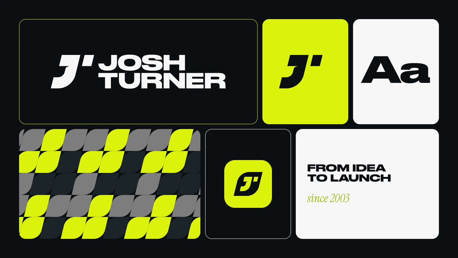
After more than two decades of building and elevating work for brands of every kind, I turned the process on myself. JT Creative is the identity behind my studio: an open J and a single tick that form a spatial T, so both initials live in one mark. It sits inside a badge that works as a stamp, sticker and app icon. From there the shape keeps going, repeating, morphing and reshaping into a family of patterns, the same way my work evolves to fit each brand it touches.
Envision. Design. Develop. Everything starts with one slanted angle. The J, the tick, the badge and every pattern are drawn on the same grid, so the pieces lock together however they're arranged. Lime brings the energy, ink and paper keep it grounded, and motion was part of the plan from day one, not an afterthought.