Kova
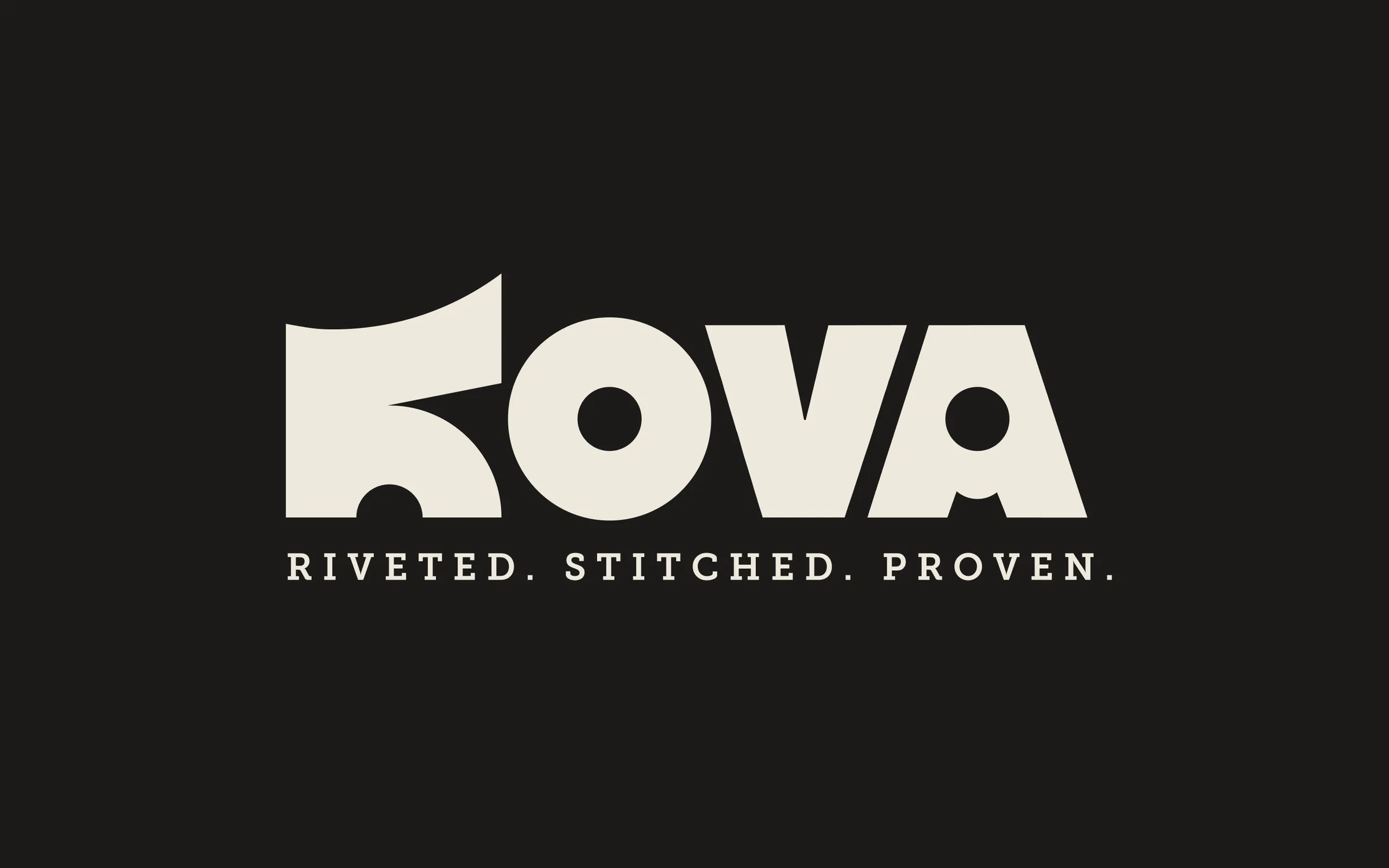
Four shapes, riveted together.
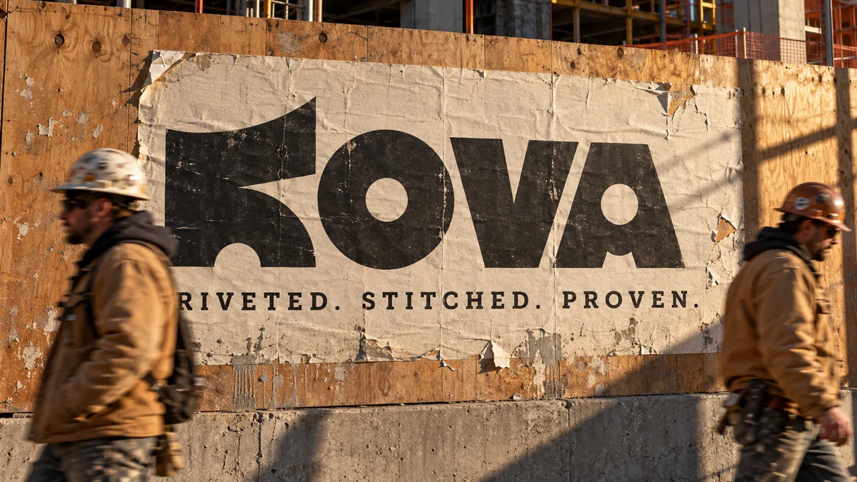
Kova is a self-initiated concept identity for a workwear brand built for the trades: gear made to last ten years, with free repairs for life. Kova is Finnish for "hard", so the identity had to feel made rather than designed: heavy, honest and a little rough, like a tool that has been used. Every choice was tested against one question: would this look right stamped into a steel plate or stitched onto canvas?
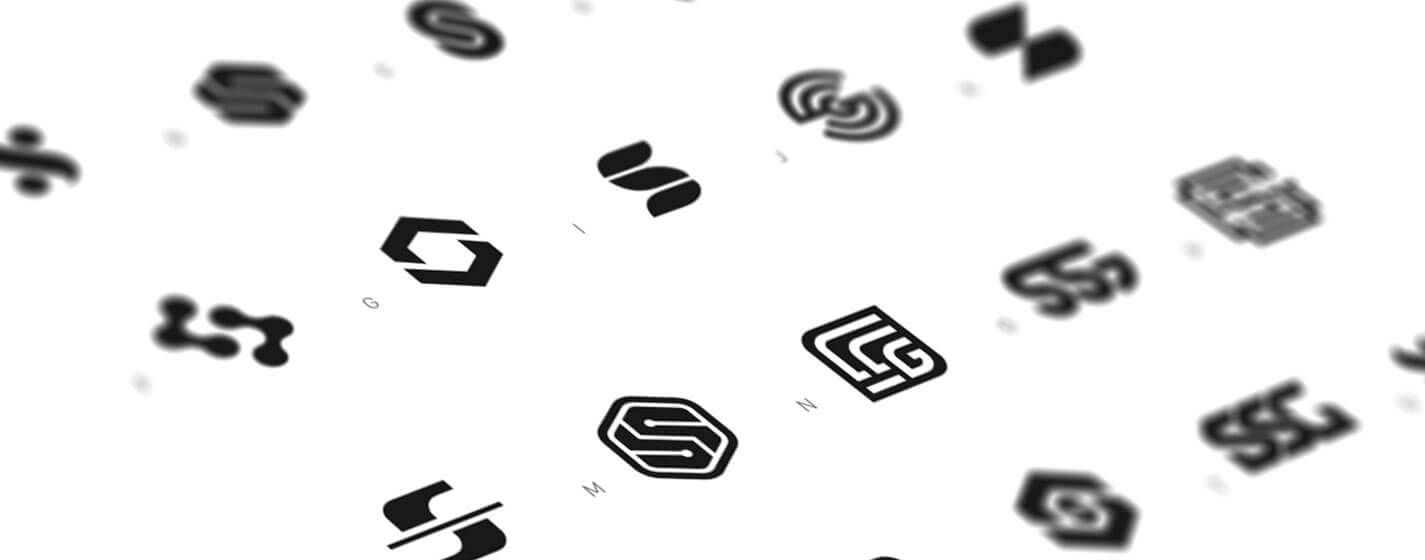
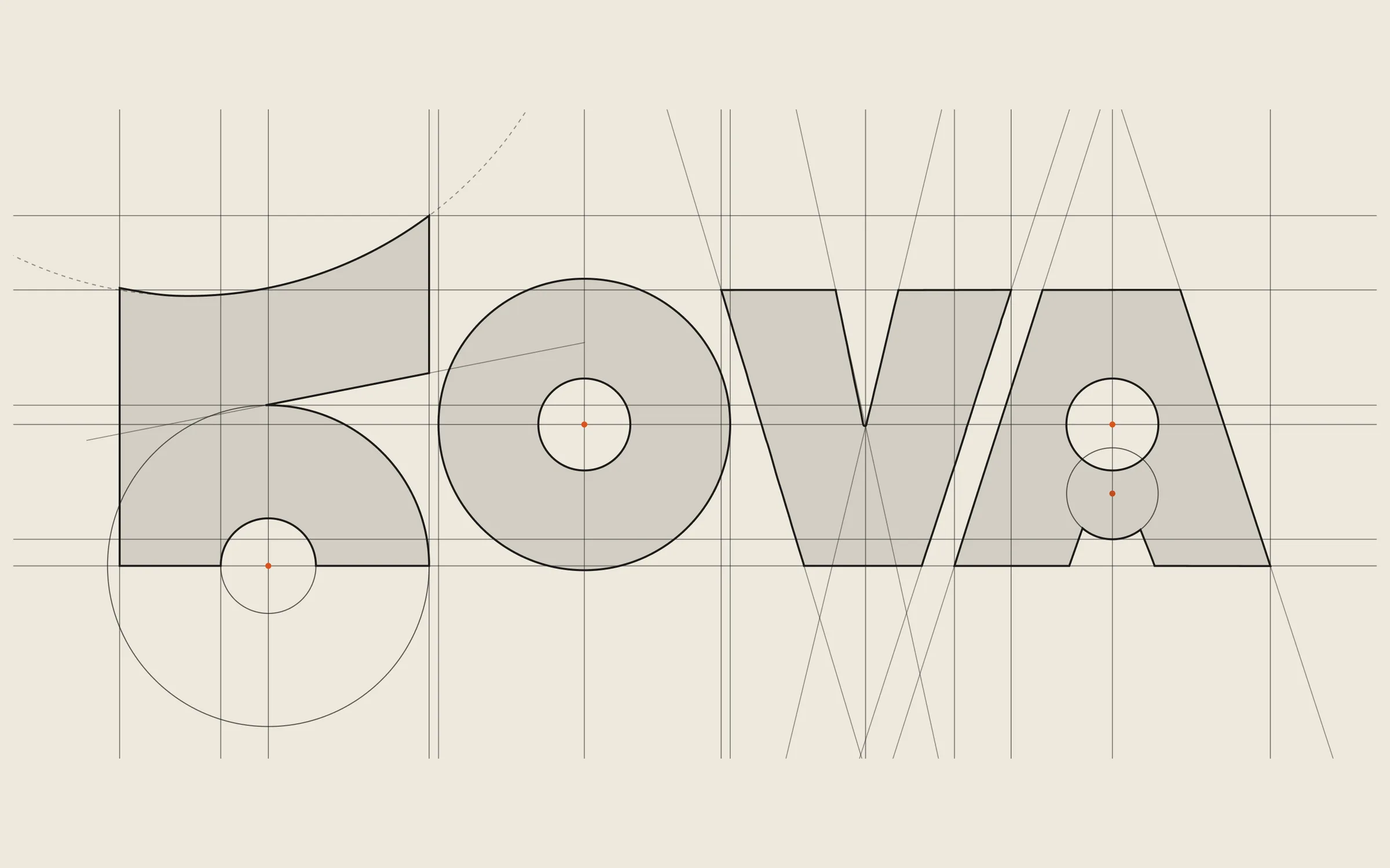
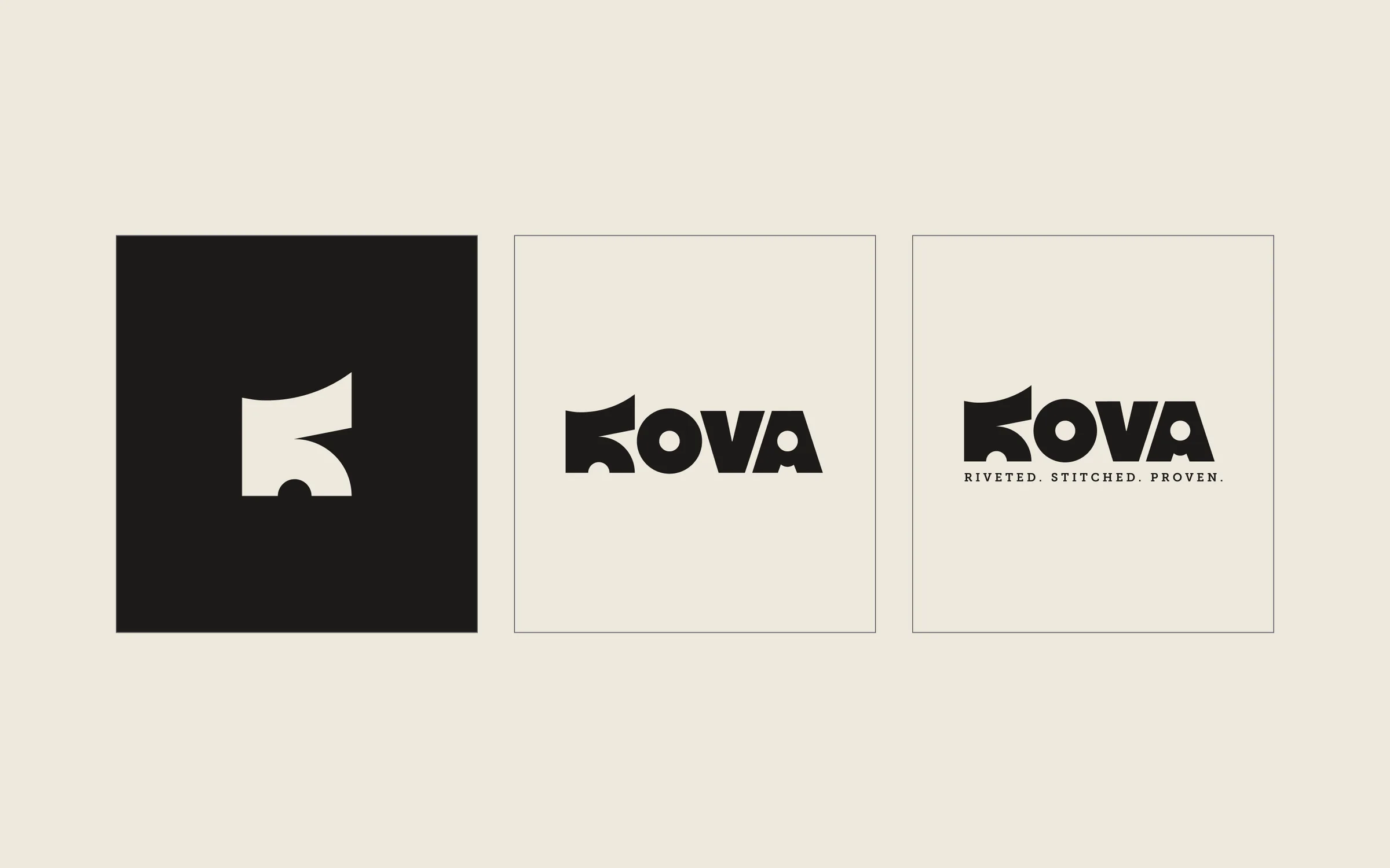
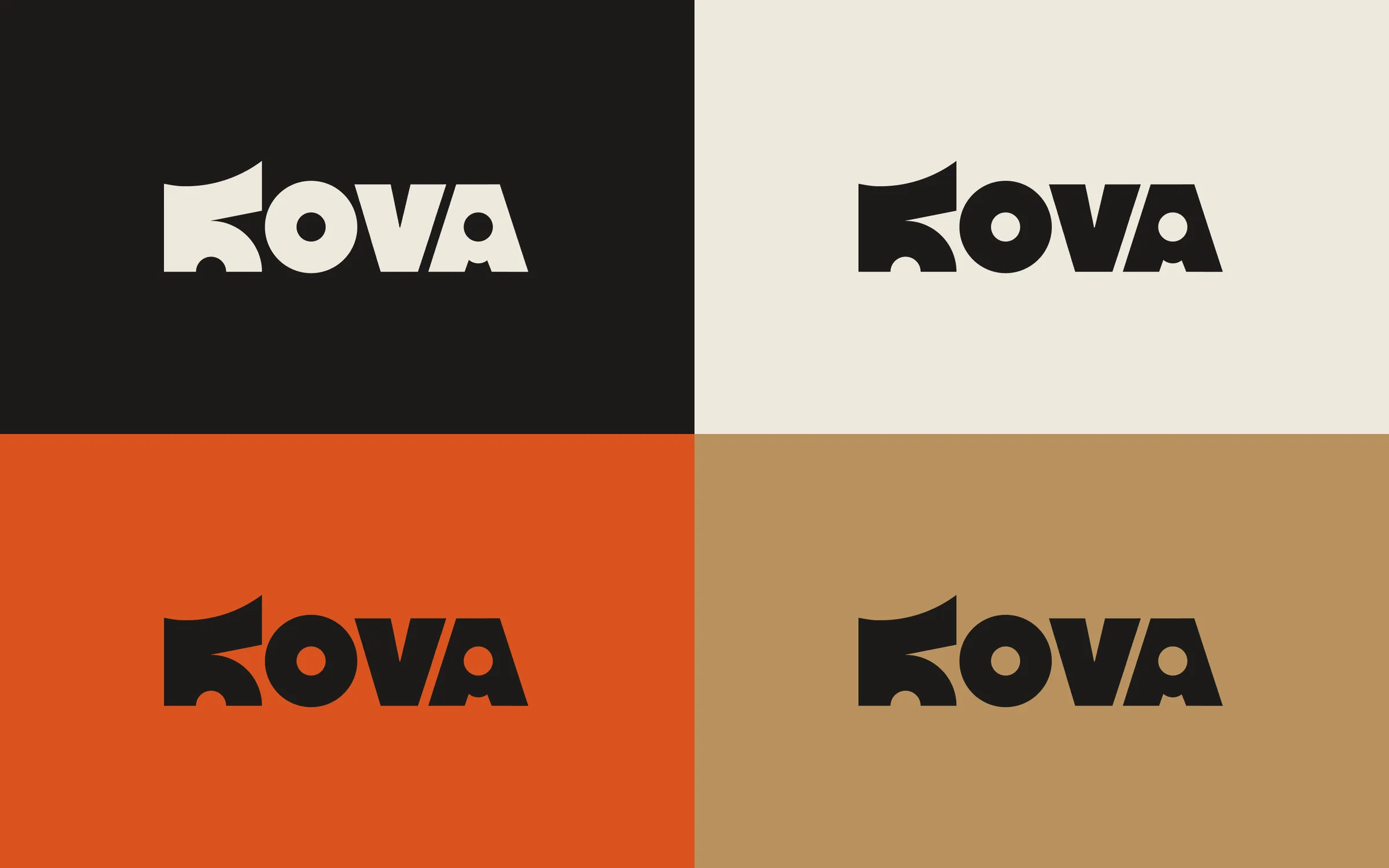
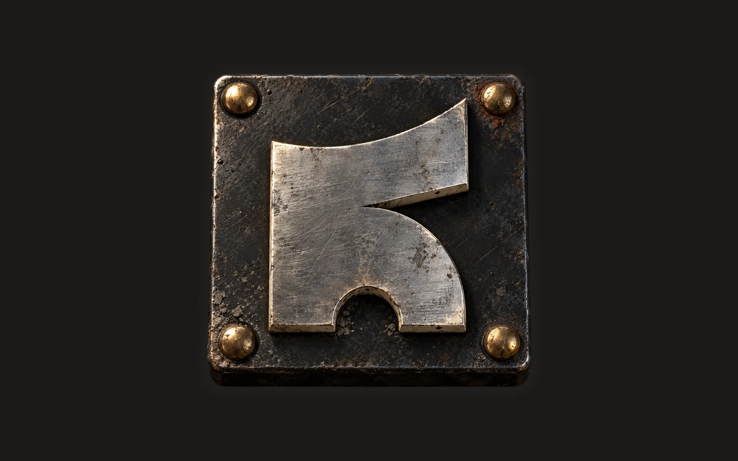
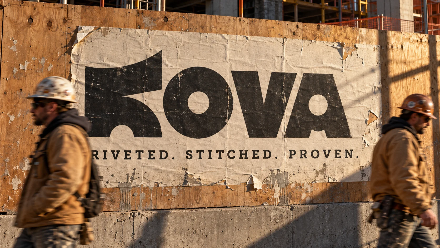
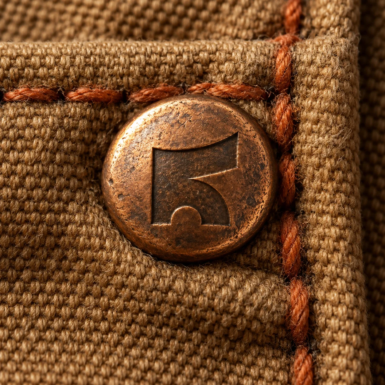
The whole wordmark is built from four simple shapes: an upright bar, an angled bar, a half moon and a circle. Nothing is drawn freehand. The K is a boot and an anvil in one, and the round counters in the K, O and A act as rivets, which ties the mark straight to the tagline: Riveted. Stitched. Proven. The logo build tells the same story in motion: each letter starts as its simplest shape and morphs into place, then the rivets punch through in Ember and cool to Chalk.
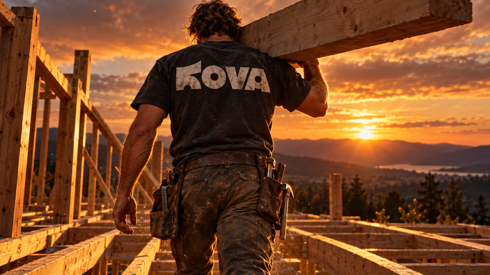
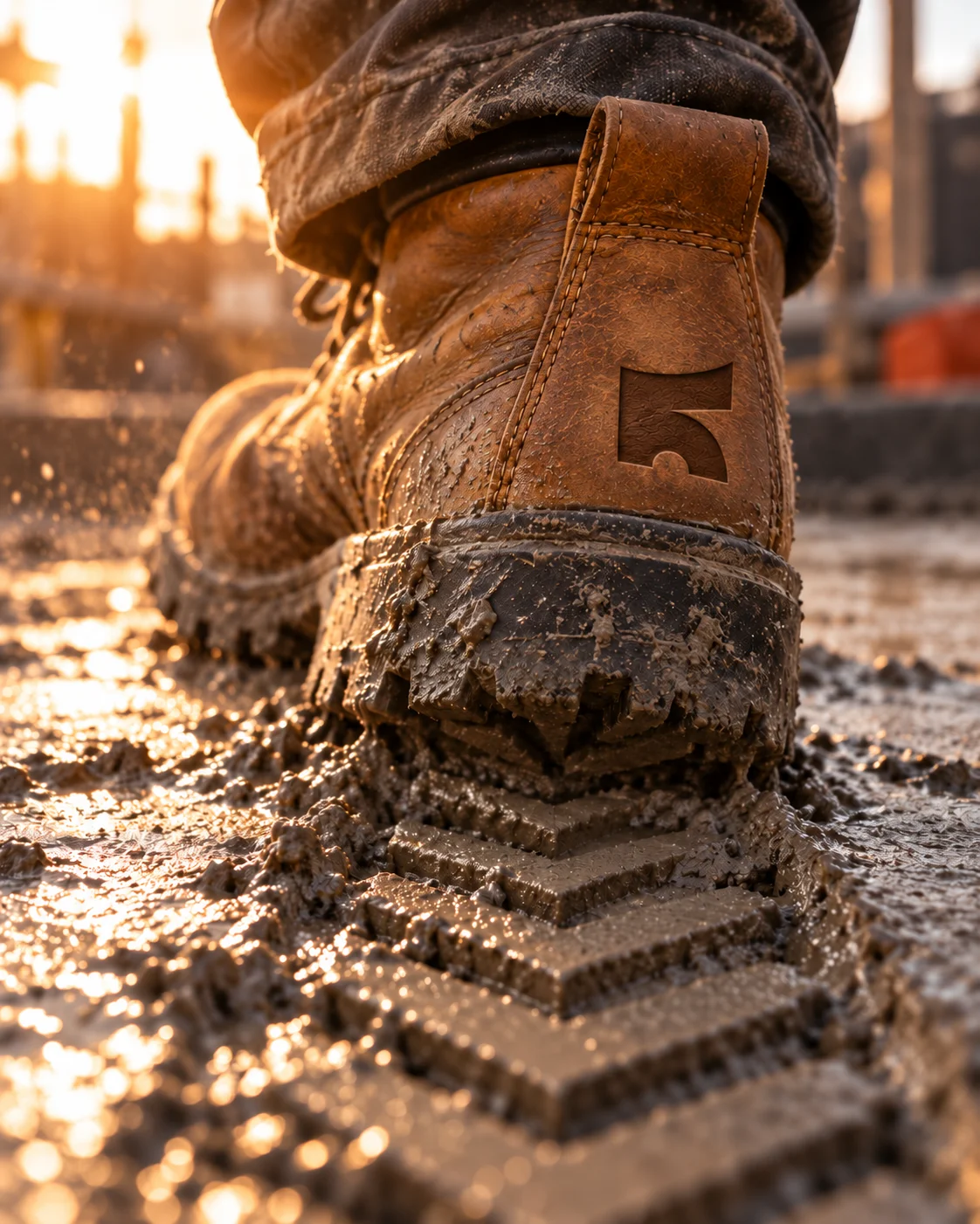
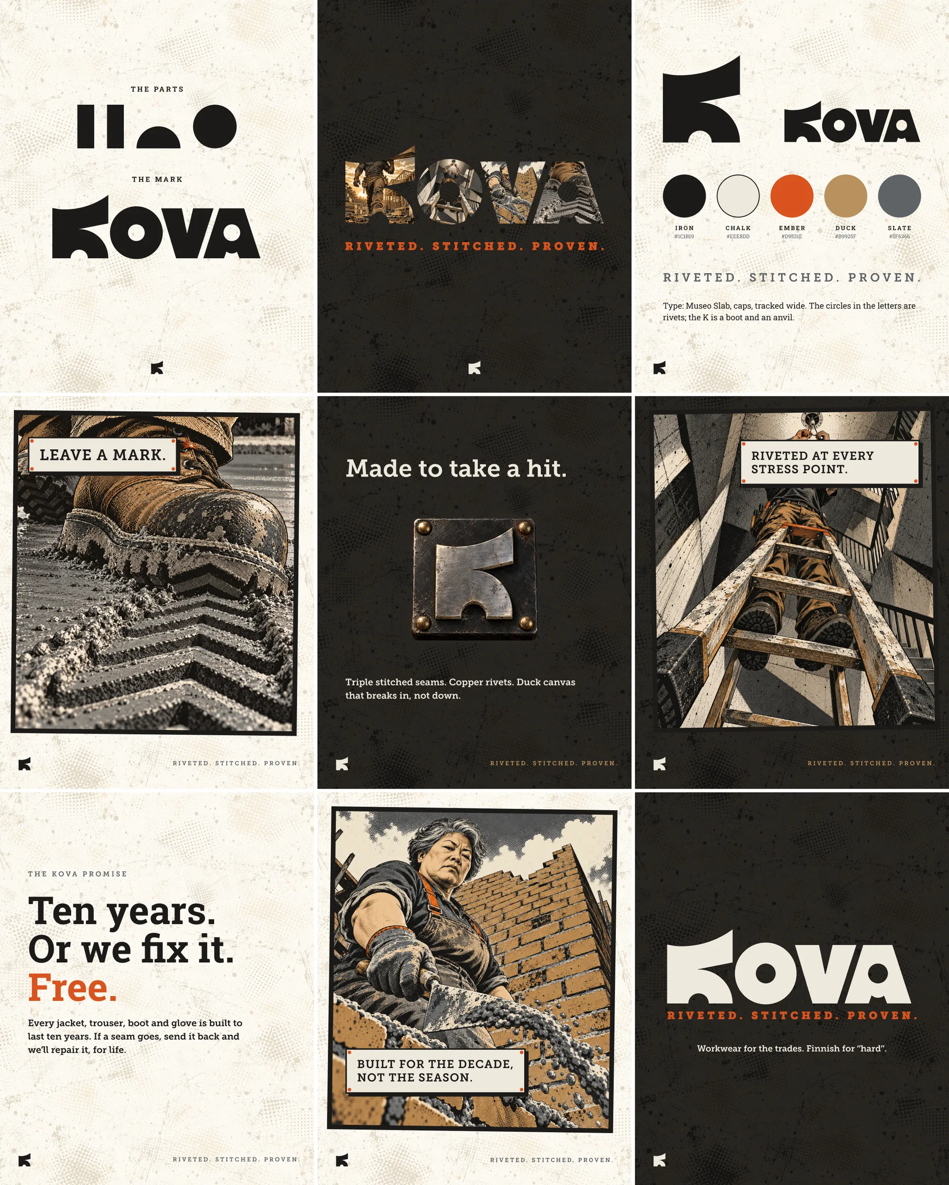
AI-assisted art direction: I used image generation, from my own prompts, to explore the world Kova lives in and set its tone. The mark, wordmark and system are built by hand from four shapes.